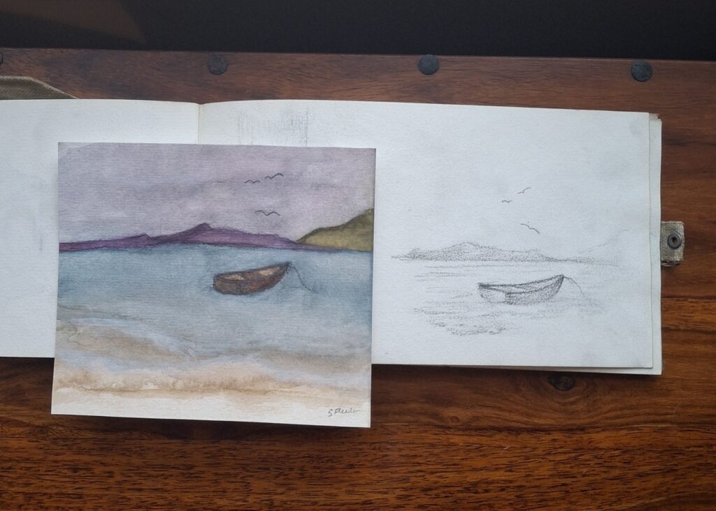
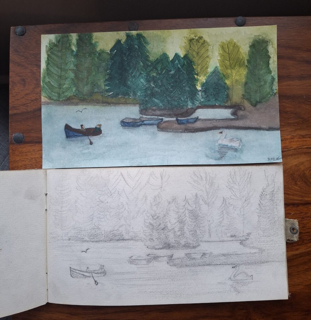
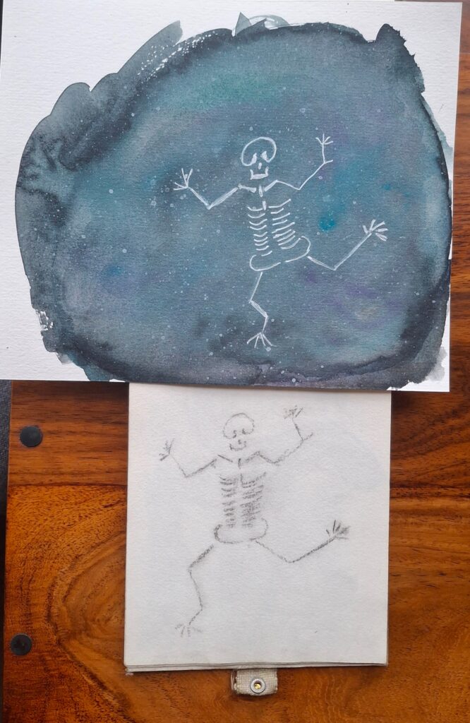
Literal cut and paste – palaeontological memes and content creation through the ages

In the same house clearance we found my great-grandmother’s sketchbook, we also found boxes of academic papers and correspondence belonging to my maternal grandfather, relating to his palaeontological research at the Scottish Geological Survey (now part of the British Geological Survey). Among all the articles he had published on the finer points of trilobites and other Namurian and Dinantian marine fauna of Scotland, we also found a few ‘menu cards’ from the Survey’s annual formal dinners.

This grand event was the place where the scientists of the Survey could dust off the mud of field work and put on their glad rags, enjoying not only dinner but entertainment too. The attendees performed skits and songs and other party pieces, all satirically referring to happenings in the world of geological sciences and office politics, and the menu cards reflected the spirit of the occasion.

Going through the menus, I wondered if they may be of historical interest to the British Geological Survey archive, which contains many photos and records of the staff of the Survey through the ages. After some brief email correspondence, I was put in touch with their very helpful archivist, and her interest and kindness proved my personal theory that all the best people are librarians or similar! 

My mum and I were invited to come and see the archive and donate the items we had. This allowed us a fascinating look through the relevant boxes’ contents, where we discovered more photos of my grandfather, as well as some of his own contributions to the formal dinner entertainment.

He had specialised in doggerel poetry of the kind written by one William McGonagall, Scotland’s unofficial Poet Dis-Laureate (and the inspiration behind awful verses written sarcastically by my family in birthday cards for generations).

These two pieces ‘A Summary of Progress’ and ‘Hazards of a Palaeontologist’ show his diabolical grasp of tortured rhyming schemes and the photo shows the sheer joy he took in inflicting this upon his colleagues!  

As I was looking through the boxes and spotting that beloved, familiar face in some of the menu cards, the realisation dawned that these menus are memetic masterpieces – silly inside jokes shared by serious men of science and brought to visual life through the art of literal cut-and-paste. 

I thought about how throughout the ages, there must have always been people who go to some amount of effort to make and share this kind of thing for no other reason than for the bit, to make others laugh. 

One example that springs to mind are the Viking rune carvings at the Maes Howe burial chamber on Orkney, one of which is impressively rendered in the hard stone around 8ft off the ground, but not ceremonial or significant. It just reads ‘Tholfir Kolbeinsson carved these runes high up’! 

There’s an entire academic book dedicated to this phenomenon in Greek vases, lots of bawdy laughs at Zeus to be had.  “For the gods too love a joke,” as Socrates once quipped.

And for a meme which travelled across the world, long before the internet, how about ‘Kilroy Was Here’? A true memetic phenomenon, the British ‘Mr Chad’ and his ‘wot no bananas?’ (which itself was a new face given to an existing humorous complaint about rationing) morphing into Kilroy, who could be found daubed onto every place where a US soldier had been during WWII. It is probably apocryphal, but apparently even Hitler was familiar with Kilroy and concerned he could be a codename for a top-level spy. 

Thinking about the way content is created on the internet, the 1-9-90 rule is often used, and while things have changed a little since the widespread adoption of social media made creating a little easier, it still holds fairly firm. The rule states that in a collaborative website such as a wiki, 90% of the participants of a community only consume content, 9% of the participants change or update content, and only 1% of the participants add content.

So the people daubing Kilroy onto a bulkhead, the artists creating vases poking fun at Zeus and his rampant proclivities, they are the memers of history, in the 1 or 9 percent – either making the jokes or actively spreading and changing them.

I’m one of them, I plague my friends and colleagues and various subreddits with terrible memes I have thrown together. And it’s comforting for me that there really is nothing new under the sun. As long as there are humans, there will be people like my grandfather and his colleagues, and like me and the denizens of imgur and reddit.

All making fun and sharing a laugh, through the mediums of rune carving, pottery, graffiti, cut and paste and shoddy photoshop.

No Green City? The story of the #urbanplantsthatdontgiveafuck🧱🌱

I started this photo project during lockdown, when I was roaming the streets on my daily walks to stave off the boredom and existential dread. It started when I noticed all the plant growth that had taken place in my neighbourhood while there was less traffic, no street cleaners, and a bit of peace for the urban greenery to take root.

By neighbourhood, I refer to an area covering maybe 3 square miles in the centre of Glasgow, mostly to the south of the Clyde with Bridge Street and Elginton Road as the main artery. I live in Tradeston near the river, I shop, go to the library/GP/pharmacy etc in the Gorbals, and I like to walk up to Pollokshields for a drink or to see pals. 

I felt an affinity with these little bits of green, thriving in the bricks and dust and some simply seeming to grow straight out of the concrete itself. I’ve always been fascinated by abandoned urban locations – Life After People being a favourite documentary.

I started taking pictures of my favourite examples, collecting them on Instagram using my own very specific #urbanplantsthatdontgiveafuck🧱🌱 hashtag.

Over the course of weeks and months, I started to notice other, really cool-looking things about my neighbourhood. A lot of it is very stereotypical ‘gritty urban’ with abandoned buildings, piles of rubbish and general disrepair, but there are also some incredible sunsets, lush green growth and photo-worthy tableaus laid out on the streets. 

(I’m not exaggerating the grittiness by the way, a location 3 streets away from my flat was used to double as 1980s Russia for the Tetris film.)

I wanted to capture how I see my surroundings, finding it a little unfair that your average beautiful painting of a sunset or a tree tends to feature rolling bucolic hillsides and countryside, rather than featuring how gorgeous the sky looks at 4pm on a wintery November day in the Gorbals. 

I have now spent four years snapping reference pictures for my ‘No Green City?’ collection and spotting elements which repeat over and over. My brain enjoys patterns and it’s pleasing to see how the repetition can give the vibe of my locale across the set of pictures. These are the main things I have noticed and photographed:

  • Plants growing out of the city itself – in walls, drainpipes, the ground, abandoned buildings, under bridges
  • Yellow flowers mostly, and some purple but very rarely any other colours
  • Red brick both intact and crumbling
  • Bridges and river water and puddles on the concrete that create canvases for the reflections
  • Natural elements like trees and grasses joining buildings, electrical and railway wires, poles and cranes/scaffolding to silhouette against the sky
  • Dramatic skies and clouds of all seasons, plus rays of light from both the sun and the city lights
  • Metal fences and signs and traffic cones
  • Graffiti in a range of bright colours and white
  • Shadows, sometimes of me

I have over 350 photos in my collection now, and have put my favourite ones into this gallery on my art website. I’ve also been using them as inspiration for art – not just paintings but jewellery too. Making a necklace to celebrate your favourite crumbling wall might be a bit weird, but it’s what I want to wear! 

I’m planning to do more paintings and also have an idea for a stop-motion short so once I have taught myself how to do that, I’ll be back…

The little paintings that took over 100 years

During a family house clearance, my mum discovered a few things which belonged to my maternal great-grandmother, and it sparked a small artistic project of mine.

Born on 1st May 1899, Elizabeth May Denholm Dunn became a teacher of dress-making and millinery in Glasgow, as well as a talented artist and an award-winning bobbin lace-maker. I remember her from when I was a very small child, as she was long-lived and resided with my grandparents until her death. 

I mostly recall an old lady in a bed, almost unable to believe, as children do, that ‘old people’ were once young. But the walls of the house bore evidence of her earlier life.  My favourites were the pictures sewn so intricately that, from across a room, they looked like oil painting. One of those pieces now hangs in my own home and I have a small box of her delicate lace too. 

But it wasn’t those which gave me the inspiration for this project; I also inherited her sketch book from 1919, when she was 20 years old. Flicking carefully through this narrow portable book, and seeing the way she captured the landscapes and people in her life, gave me an odd sense of connection. 

The way she sketched felt familiar – the way she indicated to herself the detail of the different types of trees, the crooked lines of a jaunty skeletal figure. I could sense one of those silvery threads of time tugging from her hand, through the years on the page, to me.

In a move that I am describing as ‘ancestral inter-generational art’, I used my favourite two sketches as the basis for a couple of little watercolour paintings of my own – bringing a little colour to what she quickly captured in 1919, over a century later. 

I imaginatively called these ones ‘Boat’ and ‘Pond’.

I also made a celestial version of the vaguely-cryptid skeleton creature, using white gel pen to pick out the shape as if it were the lines of a constellation. I know I will now think of her whenever I look at Orion on a dark night.

‘Osteon Constellation’ and the insert page of the sketch book.

The familial connection between us is also apparent in these photographs of us both concentrating on a creative project. The one of her is from the Ayrshire Post in 1971, when her bobbin lace-making was the subject of a feature article. Compare it with this quick sneaky shot my husband took of me sketching the view from our hotel balcony on holiday this year – that jowly concentration face is something we share! And a love for portable sketchbooks apparently.

And here are the finished pieces as scans for detail/because I just figured out how to use the scanner on the work photocopier…

More than ‘just a bartender’… more than ‘just a pub’.

Note: This was originally written to promo Joe ahead of the 2024 Scottish Bar and Pub Awards, for the new ‘Bartender of the Year’ category. He didn’t win but he was shortlisted and did get to go to the fancy awards shindig. And the Laurieston has recently been included at number 32 in the European Bar Guide’s Top 100 Bars in Europe.

Here’s my little piece on why you should nominate Joseph Clancy, of the Laurieston Bar, located here in the sunny climes of Bridge Street, Glasgow.

The Laurieston has been open since 1836, and Joe’s family took it over in 1982, so he’s got all the traditional Glasgow pub ancestry he needs. There were a few local headlines last year when the pub was put up for sale by the locally-renowned family, but thankfully the only thing that’s really changed from the punter’s point of view is that maybe the bar towels aren’t ironed as promptly as they used to be. Or at all. Sorry Ann. Also they do Tennent’s now, but the jury is still out on that one.

Now, I like to swing by a few times a week to have a wee late afternoon pint (and get in the 941 steps that my app tells me is the distance from my flat to the pub). And, like many of the regulars, I was a bit concerned at having to now learn the names of all the (awesome!) new staff who came in after the changeover.

I can say we all relied on Joe to subtly (!) remind us of the names which went with the fresh new faces, and in turn keep them right on our wee habits. Gods forbid Gus has to drink his cider out of those branded glasses he inexplicably loathes or Brian have to drink his ale out of a chilled glass when he likes it warm!

But it’s more than continuity. Despite his love of playing practical jokes (someone take the cling film away from him) and his general tendency to annoy the bollocks off of us, he’s a really kind and supportive person in our community and he actually cares about folk.

I was in earlier and spoke to Nico Liverani, the General Manager of the new guard, who said: “I’ve not worked with anyone in ten years of hospitality who is more dedicated to their job, in such a genuinely caring and conscientious way.”

He also helped me to spell ‘conscientious’ because I might have had a couple of beers while writing this on my phone notes in the bar.

As an example of Joe being… well, himself: I started a small business last year and I’d been boring the arse off him about my new venture whenever I popped in. When I finally launched, he was one of my very first customers, handing me a tenner and telling me to ‘bring me as many dinosaurs as that buys’. One of the magnets I supplied him is still stuck on the door of the big fridge in the bar.

I also got married last year and once again, he stepped up, listening to me moan about the planning, and then helped me get some amazing shots for my wedding album. Our reception venue was across the road so I briefly left my husband to manage the relatives while I nipped in for a cheeky pint/photoshoot. (Joe did receive his own invite but true to form, he was busy in the bar and instead organised a lovely card and whip-round for me.)

In summary, he’s exactly what a local pub bartender should be. Just as the Laurieston is exactly what a local pub should be.

So go and nominate Joe. And in the wee bit on the website form that asks why, just say that he’s the bartender every pub deserves, but that only one pub is lucky enough to call him its own.

Related pictures:

You’ve heard of data visualisation, but what about sonification?

Data sonification is the auditory sister to visualisation and is a fascinating example of using a non-visual human sensory experience to process data. It can allow people, including blind and visually impaired communities, to listen to datasets, in the way you might look at a graph. This allows for aural pattern recognition and exploration. NASA is a big fan – check out their audio library.

In its simplest form, data sonification can even be heard in your own house – think about the ping of a microwave – you are being conveyed data (in this case ‘lunch is ready’) in an audio format. Slightly more complex than that, you have the example of Geiger counters. Radiation data is conveyed through that ominous clicking sound which has become iconic in film, TV and gaming.

This piece has an excellent discussion and history, this one has more info and examples as it gets more and more complex. And you can lose a chunk of your day by browsing the Data Sonification Archive.

There’s also a great article from the US National Center for Biotechnology Information about how musicians and scientists are working together to explore data through sound.

I also have a headcanon that Uhura, one of my favourite Star Trek characters, understands how sonification works.

In her song in the Strange New Worlds musical episode, she sings:

“The patterns repeating
Guiding and teaching me
I know I know
Listen for signals”

(As an aside, my day job title is Communications Officer which I love because that is what Uhura’s job title is and she’s a spacefaring badass.)

Now, I have always been fascinated by the representation and communication of data and I also love music. So when a colleague recently told me about data sonification, I became immediately obsessed and added it to my ever-growing list of projects.

I have composed this experimental piece to try out some very basic data sonification of my own, using a simplified dataset representing the lengthening of the days and the changing times of the sunrise and sunset in Glasgow, from the winter solstice to the spring equinox.

It’s called ‘Coming out of the dark’ and I think it’s interesting to listen to, with parts that are genuinely beautiful ❤

Listen to the audio on Biteable.

For the nerds in the room, here’s my process:

I downloaded the dataset, simplified it slightly to make sure I had a manageable number of data points, and set about converting the numbers into musical notes, using a simple translation system.

The 36 white keys on the piano make up 5 octaves of the major C scale, which I designated C1, D1, E1…C2, D2… with middle C being C3. In the piece, the sun rise starts at the winter solstice on C3 and sun set at G3 so the day is as long as 3 notes apart in the same octave initially. As the days lengthen, the sunrise and sunset pull away from each other (ie the sunrise gets closer to the previous midnight as the sunset gets closer to the upcoming midnight).

So by the spring equinox the sunrise is much deeper into the previous night and sounds like C1 and the sunset is higher into the future night so sounds like C6!

Then I taught myself how to use a lovely (and free!) piece of composition and notation software called MuseScore and mapped it all across (I also had to relearn how to read bass clef lol it’s been a while).

I then added in some cello sounds to represent the data of the lengthening days to round out the sound, with a gentle, slow rise across the piece.

Note: there is software you can use to do data sonification automatically, but I learn by doing things manually and wanted to add my own spin onto it!

Living in a digital neighbourhood

How many times have you been patronised by an offline person who assumes that anything done online is frivolous and somehow not ‘real’?

Comments such as: ‘I have *real* friends’ or the classic Boomer complaint of ‘PHONE BAD!’, are all too common.

I spend a lot of my time in what I think of as my ‘digital neighbourhood’.   The people living with me day to day are the people on my social media. They are real people, my real friends, living real lives alongside mine, we just happen to be on different parts of the blue rock.

I know a couple of my closest physical neighbours to say hello to, but ironically I get most of my interaction with even these traditional neighbours through our area’s Facebook group.

In-person communication and (ew) phone calls are often touted as being some kind of moral standard, usually by the same people who share this type of awful content on their Facebook, using their phone. But that’s different. Somehow.

Smart phones are apparently demonic devices that stop your kids interacting with you. Maybe your kids don’t want to talk to you because you’re a terrible, judgemental person, Sandra.

For me, being in a digital neighbourhood gives the same ‘ambient knowledge’ about people I would get from existing in the same meatspace as someone else. You know, the stuff you pick up without really registering: where they’re going on holiday, how the kids are getting on, what their pets look like, how much they hate their job… things that give you a sense of belonging to a community.

Also, digital neighbourhoods have the ultimate advantage – you can make people leave yours by simply deleting them. Clickety-click.

An ode to lists…

Being equally cursed and blessed with AuDHD, and also a former librarian, I’m aware that I’m probably… less casual than most when it comes to generally writing everything the hell down.

I take it a bit further than just a to-do list though. I have The System™. It involves several whiteboards which have a support module of paper notebooks, two electronic calendars, several typed lists for work, a few spreadsheets and a Google Keep addiction.

Like everyone who works in an office job and/or has an organised partner/family, I get loads of emails/calendar invites for things, which I add to my electronic calendars automatically when someone sends me something. I have running lists and step-by-step process documents for work and my own projects and I have spreadsheets which track long-term plans and stuff, usually all made when I am hyperfocusing on the act of planning itself.

Crucially, the whiteboard step is the key to this whole thing working. My brain runs so fast that, when I have a randomly-occurring thing to remember, by the time I located the correct list, or opened the right app on my phone, I would have already had 574389260y8932 other thoughts and the one I am trying to keep would be lost to the oceans of mental noise.

The System™ works because it allows me to easily write things down at the very nanosecond I have the thought or someone wants to make plans with me. By lunging at the nearest wall-mounted whiteboard and scribbling or sketching with a marker pen, I can facilitate having a clipboard for my brain, in the way you can have things in your computer’s clipboard for copying and pasting.

It works best when I am in the house, but I also carry post-it notes and a pen when I go outside, they are a moveable substitute!

Somehow seeing the things, which I know I won’t remember otherwise, represented in the real-space and not my colander-like brain, is soothing. It takes a lot of the stress away – it’s like thoughts stop being goblins in my head and start behaving nicely!

Another key part is it doesn’t have to be a ‘proper’ reminder with a specific time and place and additional info, or even have real details beyond that it exists at all. I failed at using to-do lists and calendars for decades because I didn’t understand that I simply need a reminder that there IS even a potential thing that was vaguely mentioned at some point in the past.

I’d wait to put something in my planner or on a running list until I had all the information. That. Does. Not. Work. For. Me. The thought maelstrom that passes for my consciousness will erase the notion for which I am awaiting further details or inspiration, and I simply won’t know that I even need them, because why would I chase details for something I don’t know exists?

What I need is to record the essence of the thing and feed it into The System™. Once I know something is a thing, I can usually then figure out details based on the reminder itself. For example, if a pal says in a messenger conversation that they wanna go for a drink maybe Thursday next week, I IMMEDIATELY write it down on a board. If my husband says his family are planning a thing vaguely around the somethingth of July I IMMEDIATELY write it down. If I have a flash of random inspiration about an art project, I IMMEDIATELY draw or scribble a reminder of the gist of it, something I know will trigger the deeper idea.

And I really mean I write down ‘drinks with Matt, Thursday, probably that place we go sometimes, message him on Monday to see’, ‘the somethingth of July, potentially husband family thing’ and ‘use those jewellery eye pin thingies as armaments for the slug sculpture!’. It can take a while to dial in the exact words to write; I also have a system of personal doodles/hieroglyphs I use as shortcuts.

And the System™ works not only because it traps all things within it, but because it acts not only as the net for the things, but the map to where the things are too.

I have a designated weekly map whiteboard, which I ‘set’ every week in a little Sunday ritual that speaks to my soul. I go through all my calendars, emails, other whiteboards and lists and I identify the things I definitely need to remember for the next 7 days. I then put them onto the board and bingo! I understand the shape of my week. I can then set phone alarms, figure out transport plans, seek further details etc because I am no longer flailing to catch up with forgotten plans, I am proactive in my forthcoming week.

Yes, it’s a lot of mental work and effort and yes it’s taken me a long time to get to this point. But I have accepted it as simply something I need to manage. In the way I take inhalers for my asthma, I have The System™ to manage my memory.  I now manage so well that I haven’t double-booked myself socially or missed an appointment in months.

THE SYSTEM™ WORKS, BITCHES!

Ahem… *adds ‘keep neurodivergent organisational systems fetish a bit quieter’ to the whiteboard*


Information literacy and searching: still haven’t found what you’re looking for?

In these days of ‘information overload’ everyone knows how to type words into Google (I almost wrote ‘a search engine’ but for most of you the primary-coloured, OED-recognised engine is the default) and pull up squillions of results.

Most people (a staggering 99.37%!) don’t look past the first page of results and some people are unaware that they could be getting better results by using simple information literacy skills to boost their search.

The trick is to know what you’re looking for and then fit the search strategy to your information needs. 

If you just want some ‘headline’ information or to pull up the Wikipedia page or a company website then fair enough, type a couple keywords into Google and you’ll find roughly what you need.

But what if you have more specific needs and aren’t sure what to type into that little box?

If you’re looking for a specific document (ie a journal article, policy paper etc) then try using an “exact phrase” search – it cuts out the white noise of irrelevant results – those wee quote marks do save you time.

When using a specific database (academic journals for example) it can be worth finding out if the search function on it has any particular quirks.  Wildcard searching using an asterisk and obeying basic Boolean logic can help you when the search function isn’t quite as intuitive as you’d like.  This PubMed tutorial from the US National Library of Medicine is a good introduction.

The one thing I’d recommend, which surprisingly few people I have spoken to actually use, is the function on Google which allows you to search within one specified site.

Often local and national government sites can be designed for people who work within ‘the system’ and not for a casual user and so the search function on the site itself is not exactly brilliant.

Simply type ‘site:’ then without a space, type the www that you want to search, then type your keywords inand press return. Like this:

site:www.thisismadeup.scot search terms yada yada

Here’s an example using the Scottish Government site.  Saves time and frustration when staring at meaningless or non-existent search results brought back by a rubbish on-site search function.

Anyway, I hope you all find what you’re looking for eventually, even if it involves self-indulgent, overblown stadium rock. The best kind of stadium rock.

Making your website content better – part 4

This is the final blog in my wee series looking at website content review processes – aimed at website managers working in public sector and research organisations.  Read the first blog on overall processes, the second on content reviewer guidelines and the third on tone, formatting, link checking and SEO.

In this blog I’m going to outline a few websites which I think are great examples of content which showcases research and policy information.

I’ll be concentrating on language and tone, as I think this can often be overlooked, particularly when dealing with complex research information.

As a side note about language and tone, it is interesting to note that, on all the sites, content tone changes depending on the part of the site.  For example, the About Us section tends to be the most ‘friendly’ but publications metadata and more technical explanations tends towards a more formal tone.

Useful to keep this in mind – think about why a person is reading a particular bit of text on your site, not simply thinking of it as generic website content.

I’d also like to flag up 4 Syllables – a fab Australian web resource for web writing. I found this page and the accompanying checklist really helpful.

Anyway, on with the good practice examples:

Social Research Unit at Dartington

Overall use of a friendly tone but still appears professional as the overall tone and language are at the right level.  The text also outlines very clearly what the organisation does, eg: ‘We are also a strong advocate of prevention and early intervention based approaches.’  This is a good tip – be clear and avoid management-speak if you possibly can…

Joseph Rowntree Foundation

I particularly like how the About Poverty main section briefly outlines the main questions: ‘What is poverty, how is it measured and what can be done about it?’ and then goes on to give the reader an overview of this complex issue and how it links to the JRF’s work.

Their About Us section also has a clear message right at the top, briefly explaining their overall aim: ‘The Joseph Rowntree Foundation is an independent organisation working to inspire social change through research, policy and practice.’  Clear and concise, without jargon!

Oxfam UK

Nice examples on the ‘Issues we work on’ page of encapsulating a top level message about topics the organisation works on – for example:

Food: We’re working towards a world where everyone has enough to eat and the opportunity to earn a decent living.

Businesses and poverty: Good business is about more than making money. Companies can help lift millions of people out of poverty.

This not only gives a message about what the aims are but also helps the user to navigate easily around the content by giving a ‘hook’ to get people interested in reading more.

Thanks for reading – hope you found this series of blogs useful and feel free to tweet me any tips of your own!

Making your website content better – part 3

Hello, this is the third blog in my series looking at website content review processes – aimed at website managers working in public sector and research organisations. Read the first blog on overall processes and the second on content reviewer guidelines. In this blog I’ll look at a brief example checklist which can help you to ensure consistency of formatting, tone, language and even improve your site’s SEO (search engine optimisation) as part of the content review process.

Once you have completed the review process for any content which needs a subject expert reviewer, you can move on to checking and updating the site page by page. I tend to do this by myself as having one person with an eagle-eye view of the formatting, language tone etc makes everything flow a bit better than having it done piecemeal by a team of people (and also I’m a bit of a control freak!).

Here’s the checklist I use on each page to remind me what to check for and update/include if necessary. It’s pretty short but helpful as a reminder:

  • Tone and language – for example saying ‘we’ and our’ where appropriate to make the content sound ‘friendlier’, sentences not too long, jargon and acronyms definitely explained fully etc.
  • Ensuring visual formatting is consistent – for example all headings of the same level appear in the same font style, consistency with use of bold and italic text, images all have consistent alt text etc. Again, the specifics will depend on your own website style but as a rule it’s good to have things the same across the site to ensure a smooth user experience.
  • Automated link checking – I use Webmaster Tools for this. However don’t rely on it to find links which are what I call ‘broken relevancy’ links…
  • Replacing ‘broken relevancy’ links – by this I mean something which is still a live web page (and so doesn’t return a 404 error) but where the content is no longer relevant or appropriate to serve the purpose of linking to it. If you’re following the process I outlined and the reviewer guidelines then your subject experts should have picked these out already so all you have to do is replace the links with what your reviewers have suggested.
  • For improved SEO try to ensure that links use keywords – for example instead of using ‘click here’ as the hypertext, try to use text which includes words relevant to the content of the page and the content on the page you are linking to.

Hopefully this is a helpful example of the key things to look out for – and remember, doing this properly once and getting a process in place means a future of being able to do ‘quick and dirty’ content reviews! Also, for xkcd’s take on the important of content, check out this comic.

In the final blog of this series I’ll be looking at examples of good practice in presenting research findings and policy information on the web.